Link Health and Community
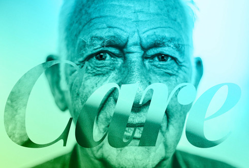
A brand refresh was undertaken as part of the website development for Link Health and Community. Retaining the existing logo was a prerequisite, being a known identity to the local community. Extracting the triangle shapes from the logo, we conceived a brand device. A visual brand audit was undertaken, reviewing past collateral to determine a colour palette that would ‘link’ the past to the present, thus the introduction of specific bright, bold, colour combinations merging with the brand device. This would set the tone for the overall website. A powerful opening animation scene was crafted to introduce the new look where a dynamic line can be seen ‘linking’ and connecting the community, then creatively ‘links’ through to the logo. Simple, yet effective headlines were applied to the photography to further reinforce that Link is there for their community. Colourful icons were also created to highlight the main services and pages throughout. View the website.
A joint project with Hootville Communications.

